Scholastic Art & Writing Awards
Art direction, design, production supervision, key liaison with web developer
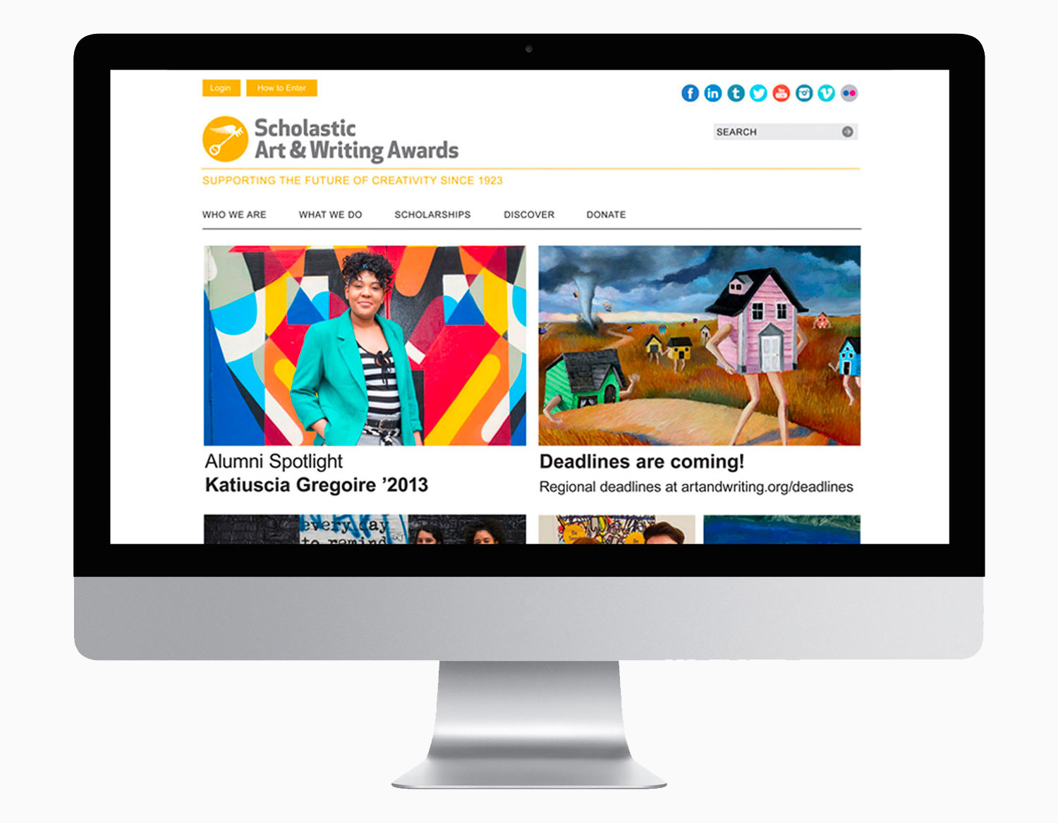
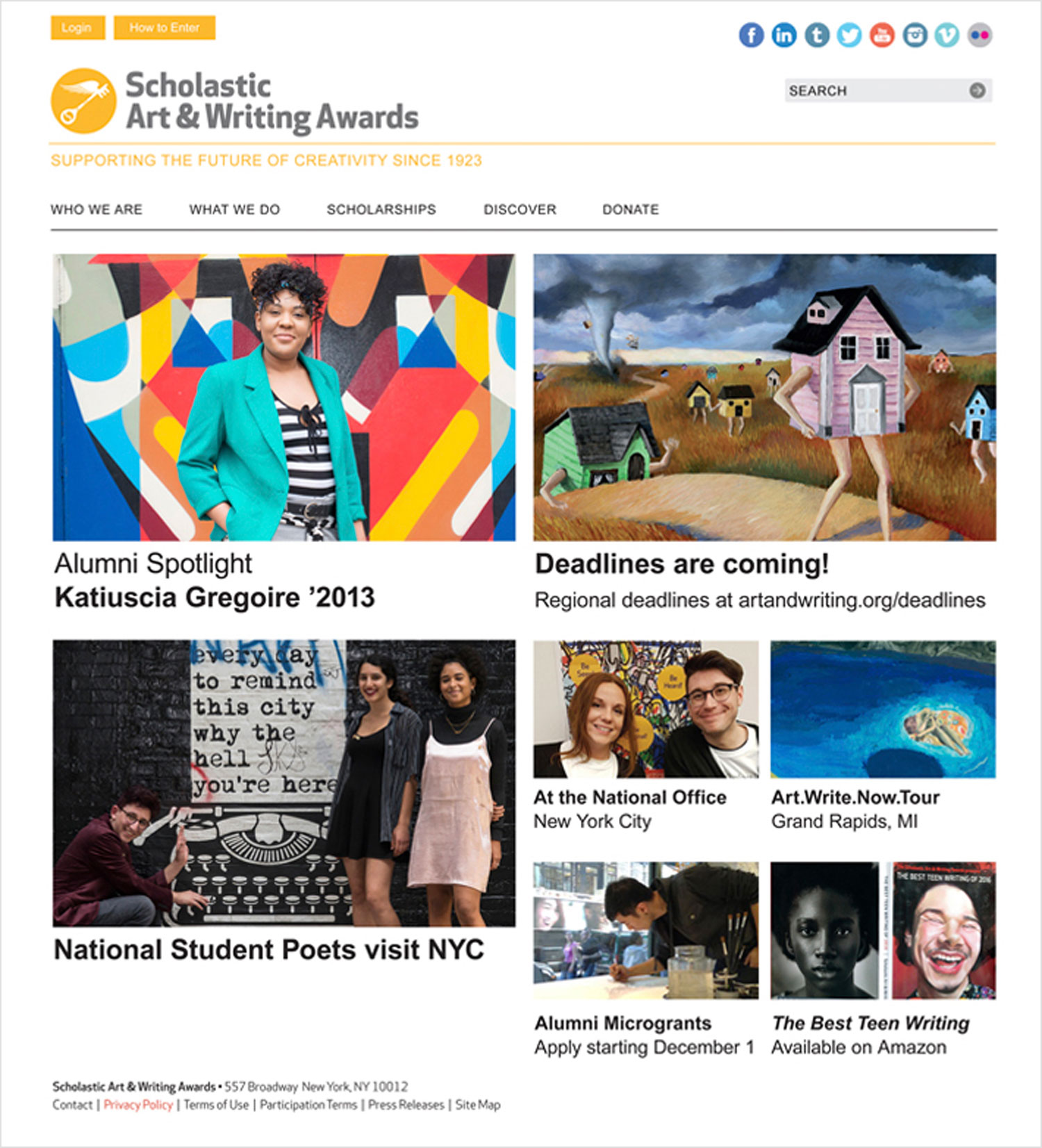
The Scholastic Art & Writing Awards is a nonprofit organization whose mission is to identify students in grades 7–12 with artistic and literary talent. Through the Awards, teenagers receive opportunities for recognition (an Awards ceremony at Carnegie Hall), exhibitions (at Parsons School of Design and Pratt Institute), publication (the National Catalog and The Best Teen Writing anthology), and scholarships.
•
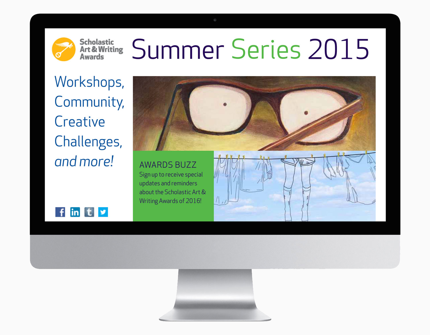
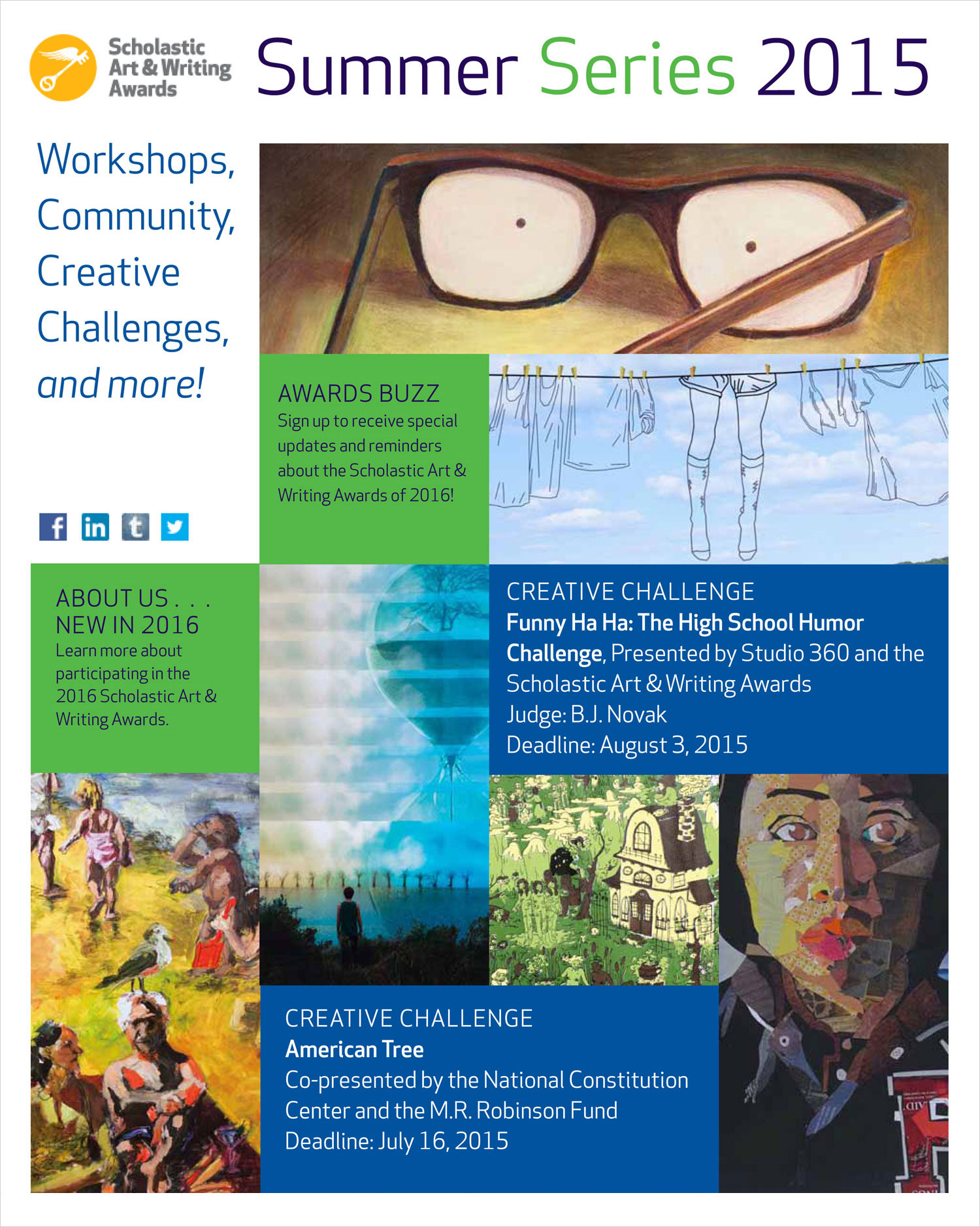
Website redesign
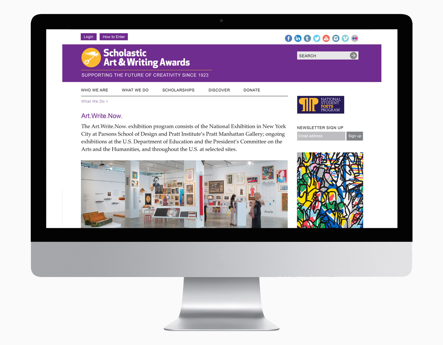
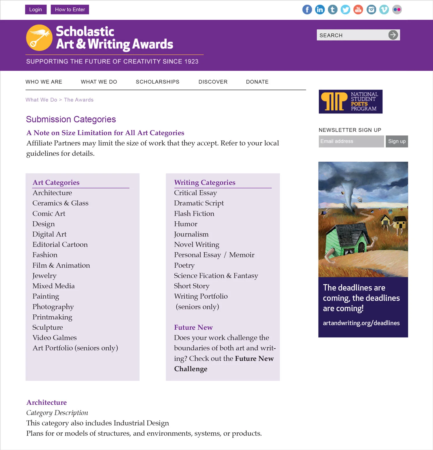
The website promotes the organization to a wide audience that includes potential funders, program partners, educators, parents, and students. The objectives were to align the site to a new brand identity, to create clear organization for ease of navigation, and to inject an inviting visual energy with bright colors and clean graphic treatments.
•
Collateral Branding
The examples shown here include the National Catalog, brochures, calendar, postcards, notebook, press kit, exhibition window (at Parsons School of Design), and promotional materials for Summer Series programs.
Scholastic Art & Writing Awards
Art direction, design, production supervision
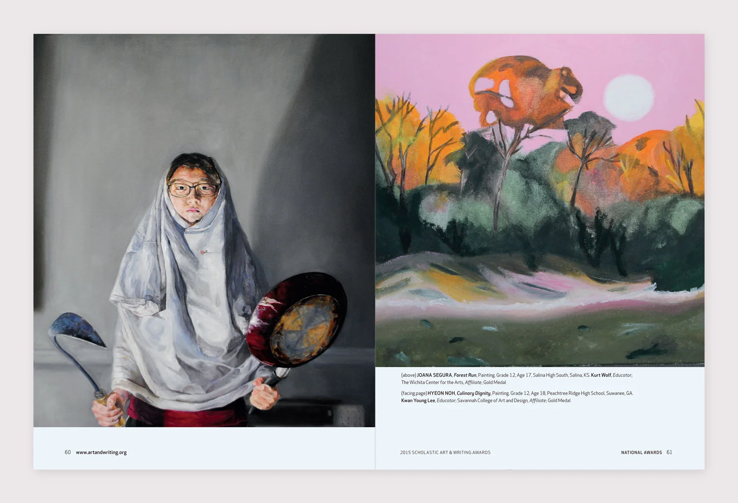
The two publications feature and celebrate award recipients' work for the 2016 Scholastic Art & Writing Awards. The objective was to inspire and motivate students to submit work to the Awards in the next year.
The National Catalog and Best Teen Writing are two key print pieces that define the design direction for the year. For 2016, the strategy was to choose two images that could be used on the front and back covers of the catalog, then reverse the order for the anthology. The features of the two portraits presented strike a balance because they are visually alike, yet also provide contrast in their differences. One happy, the other solemn, they allude to drama masks—comedy and tragedy.
Scholastic Art & Writing Awards
Art direction, design, production supervision
In 2015 we chose to highlight visual properties and themes that emerged from the collective work. For the book covers, the vibrant color palettes used on both covers tie them together on a formal level. Some common themes seen in the year's work were fantasy, psychedelic imagery and quirky interpretations of identity.
Because the visual impact of the catalog cover art was so strong, it was used on the next year’s call for entries poster and a tote bag (to carry the Press Kit).
Scholastic Art & Writing Awards
Art direction, design, production supervision
In determining a cover image, we look to works that are honest and true to the teenage experience. The photograph chosen for the 2015 National Catalog fit the criteria. The expression on the girl’s face appears dreamy and distant. Although she has a look of composure, a hint of annoyance lies below the surface.
Also shown: building mural located in Williamsburg, Brooklyn painted by Colossal Media, and full page New York Times ad.
Scholastic Art & Writing Awards
Art direction, design, production supervision
Because 2013 marked the 90th anniversary of the Awards, portraits with a classic sensibility were chosen for the publication suite.
The Great Encouragement documents the history of the Awards organized by decade. A timeline featuring key historic moments runs on the bottom of the pages and incorporates covers of publications from the corresponding era.
Scholastic Art & Writing Awards
Art direction, design, production supervision
Each year we highlight and celebrate the stories and work of our alumni through the annual benefit, Art & Writing @ Night.
The challenge was to combine unrelated artwork resulting in a cohesive visual piece. The midnight blue color blocks frame and unify the individual works without neutralizing them. The color choice also refers directly to the name of the event.
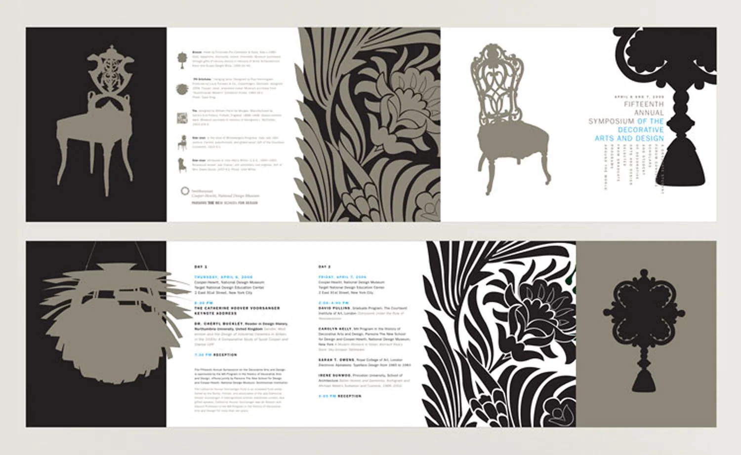
Parsons School of Design and the Cooper-Hewitt National Design Museum
Art direction, design, production supervision
Medallion
This is one of my favorite projects. Included in the promotion suite are: a poster, accordion-fold invitation, postcard, and program that promoted the graduate program and an international design history symposium. The centerpiece of the poster design is a “medallion” created from cropped features of objects from the museum’s collection. On the poster, numbers on the fragments correspond to photographs of the objects at the bottom. The concept was to refer to the process historians use to identify and date objects.
The design suite won a Print Magazine Regional Design Award, and is part of the museum’s permanent collection.
•
Swatch Book
The following year, historic textile and wallpaper designs were used as content for the symposium invitation. The invitation is composed of a series of nested cards cut at different widths to reveal the cards’ right edges, and creates a swatch book format.
Parsons School of Design
Art direction, design, production, and production supervision
Parsons’ New York City location drove the design of this suite of catalogs. Photographs of NYC icons (taxi cabs, subway cars) and Parsons’ buildings were shot to enhance motion and kinetic movement. The bright, clean color palette gave visual presence as well as consistency from one cover to another.
This was the first comprehensive publication campaign I worked on. The Undergraduate, Graduate, and Associate degree program covers were rolled out over two recruitment seasons. The interior page layouts used Helvetica (the main font of the NYC transit system). Page sidebars were set up using solid circles and bars (also referring to the transit system’s graphic identity) to define the books’ sections.
.
Defining elements for Parsons’ Graduate programs publications employed oversized, cropped letterforms, and bold, cropped images.
Parsons School of Design
Art direction, production supervision, key liaison with illustrators
This particular issue focused on illustration—or, more specifically, illustration in the age of anxiety. I built a team of illustrators from alumni, faculty, and current students, and art directed their work for the front, back, and inside covers. For the feature article about the high profile, culture-defining illustrators, I chose to present their work in a straightforward, unadorned way in order to focus on the work itself.
Flourish Baking Company